Disclaimer: This page is created with intention to be an inaccessible page for educational purposes. It will be used by AT testers for a series on website accessibility. This is one of 3 pages developed by a State team to offer education on testing with assistive technology. There is a companion page to this “Before” page, the more accessible version or the ” After page.” We also offer an AT Testing Guide to complete the training resources.
Page Sections
Headings help navigate a page from the main identification of a page to the subcategories the page contains. A person with vision might scan the page with their site to see the page organization. For a person without sight using a screen reader, they hear the content on the page. This software provides a shortcut to review the page sections labeled as heading levels.
One example of a screen reader is JAWS.

Screen reading software delivers the content of the monitor through synthetic speech. The software is a voice output screen reading program that reads content and the structure of a web page, document, email and more. In a web page, it reads headers and sub headers; table of contents, hyperlinks; a picture’s alt text description, and the content of the page. Screen reader users use a keyboard or Braille output device to navigate, but they do not use a mouse. Many operating systems used to access the web such as desk tops, tablets and smart phones, offer built in narration software.
Visuals that Move:
Images that move at a fast rate can cause a flash. A flash at certain speeds or sizes can cause a physical reaction such as a seizure or migraine. Learn more about measuring the pace or speed of your images at https://trace.umd.edu/peat.
Links
URL addresses come in all shapes and sizes. Web pages can be full of multiple URLs. To create accessible links, they should be linked with descriptive text. This allows the reader to know where the URL will take them. It allows choice of activating the link or moving on. Using a generic action to take does not provide a description of where the URL is going to take the reader. Click here for more information Or explore our web page on accessibility and web sites: https://at.mo.gov/ict-websites-webapps/ Gather insight from WCAG 2.1 on guidelines for creating an accessible site. https://www.w3.org/TR/WCAG21/
Tables
Tables are made up of columns and rows of data. Connecting the dots to what row data is associated with which column data can be a designed as a visual task when lines are formed to share the content. A Screen reader needs some assistance to understanding how to read the data to the individual. A Table needs a table header row to identify what the topics of the rows of data are all about.
In 2024 WebAIM completed a survey of preferences of screen reader users. Of those that responded, they identified with the following disability types.
| Respondent Category | # of respondents | % of respondents |
| Blindness | 1179 | 76.6% |
| Low Vision/Visually-Impaired | 306 | 19.9% |
| Cognitive or Learning | 80 | 5.2% |
| Deafness/Hard-of-Hearing | 104 | 6.8% |
| Motor | 34 | 2.2% |
| Other | 75 | 4.9% |
Color Contrast- Images – Graphics

Alternative text: what is it and how do you make sure it is meaningful? Alternative text is added to non-text content, in this case, images, to describe what is shown in the image. An image can represent branding, show who the customer is, and more on a website. Additionally, images can be added solely for design impact.
Before describing alternative text, let’s discuss the image’s purpose. If an image is added for design purpose only, this is considered decorative and should be noted as such in the alternative text form field.
When an image is placed on a web page with intention, it has a purpose. In this case, the alternative text of an image must include two things: a description of the image and the reason it is on the page. The picture above shows an outline of an ear. There are 3 lines that appear to come out of the ear and project outwards. Using this image on an audiologist’s website might emphasize their service in determining whether hearing aids or amplification products should be prescribed. If this image were placed on our Show Me Loan financing page, the intent would be different. Placing this image on a financing page might indicate the possibility of financing a new set of hearing aids.

Avoid words placed over an image. If text is over a photo, the color contrast between font and background should meet WCAG guidelines. The example below demonstrates how low color contrast can reduce visibility of the content. In this example the words “Ocean Waves” disappear into the background.
Reading Order
Use of Color and Color Contrast
Using color to communicate a label, or to denote an essential action to take or to express what is required can fail. Why? The user on the other end of the website might not perceive color. The use of color as a distinguishing identifier it is essentially, useless.
The contrast between colors, for example text against a different color background, also impacts the person on the other end of your site. The purpose of color contrast ratio guidelines ensures that sighted users who cannot distinguish between some colors can still understand content.
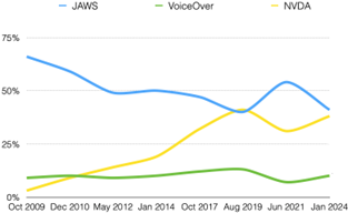
In the example below, we reduce the success of this understanding when using color to separate each screen reader’s data on historical product usage. The following chart intents to show historical trends for primary screen reader usage over 2009 to 2024. Each product: JAWS, VoiceOver and NVDA are assigned a different color. The chart shows these colored lines across the years in terms of percentage used by the respondents. For a sighted user that does not see colors it would not be possible to understand this information.
On the after page, we offer a more accessible version of this chart.

A number of assistive technologies and software programs work in conjunction with the website’s reading order. The reading order determines the order in which assistive technology will read content. Reading in the wrong order may result in users becoming very confused or getting lost on the page.
Setting the reading order lets text-to-speech software or screen readers read information sequentially. It also allows assistive technology such as speech to text to navigate a page in the correct order.
Note: It is important that a page’s navigation is logical. A logical structure allows all elements to be found or accessed.
Reading order success is addressed with the following success criteria in the W3C’s Web Content Accessibility Guidelines (WCAG) 2.1:
1.3.2 Meaningful Sequence page: Click here for more information
2.4.3 Focus Order: Click here for more information
In the example below, we have links with too small of a target size:
Fillable Forms
Before you begin to fill out the form below, you will need to have some personal identification available. You will be asked to provide your place of residence, clarify what you need from our agency and do so in an eloquent manner in order to designate what you require. In order to continue this conversation, you are expected to provide information about yourself in the form below. Immediately, place a phone call to our office if you have questions about what is requested of you below.
Audio
A video with any type of sound needs captioning. The example to the left has no captions. You will find an accessible version on the after page.
A user should be able to control the video player controls. This allows for a stop, start, play, enlarge screen or control.


